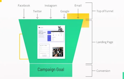
Landing Page CRO for Online Stores is critical for ensuring that your online store makes the best possible first impression on visitors. The landing page is where potential customers decide whether to stay and explore your offerings or bounce away. As a result, optimizing this page with Conversion Rate Optimization (CRO) strategies is essential for turning casual visitors into paying customers. By implementing these proven strategies, you can significantly improve the likelihood of visitors converting into buyers and enhance the overall performance of your online store.
In this article, we will explore best practices for optimizing landing pages for online stores, ensuring they effectively engage visitors while also driving sales.
1. Craft a Clear, Value-Driven Headline
Your headline is the first thing visitors notice, so it should immediately communicate the value of your store or offer. A well-optimized headline will:
-
First and foremost, highlight your unique selling proposition (USP): Clearly state what sets your store apart. For example, is it free shipping, exclusive products, or unbeatable prices? Make sure this is the focus.
-
Moreover, be concise and benefit-oriented: Use simple, direct language that explains how the customer will benefit from shopping with you.
-
Finally, speak to your target audience: Use language that resonates with your ideal customers and aligns with their needs or pain points.
For instance, instead of saying “Welcome to Our Store,” a better headline would be “Exclusive Handmade Jewelry – Free Shipping on All Orders.”
2. Use High-Quality, Engaging Visuals
Visual elements are crucial to creating a strong first impression. Since customers cannot physically interact with products in an online store, high-quality visuals are essential to convey the look and feel of your offerings. Therefore, here’s how to use visuals effectively:
-
For example, include high-resolution product images that showcase your best items. Additionally, use multiple images from different angles.
-
In addition, consider lifestyle images: Show your products in real-life scenarios. For example, if you sell clothing, use images of people wearing your outfits in real-world environments.
-
Furthermore, consider adding videos or animations: Think about including product demo videos or interactive elements like 360-degree product views to enhance engagement Landing page CRO for online stores.
Overall, a visually appealing landing page creates a more immersive shopping experience, which in turn makes visitors more likely to stay and explore your store.
3. Include a Strong Call-to-Action (CTA)
Your landing page must guide visitors to take action, whether it’s signing up for a newsletter, adding an item to the cart, or making a purchase. A strong CTA should be:
-
Clearly, clear and specific: Use actionable language like “Shop Now,” “Get 20% Off,” or “Claim Your Free Trial.” Avoid vague phrases like “Click Here.”
-
In addition, ensure it’s visually prominent: Make your CTA button stand out with a contrasting color while aligning with your overall design.
-
Lastly, repeat strategically: Include your CTA multiple times on the landing page, especially near featured products or special offers.
In short, a well-placed and well-designed CTA directs visitors toward conversion by making it easy for them to take the next step.
4. Highlight Your Key Offers and Promotions
Special offers, discounts, and promotions are powerful motivators for online shoppers. As a result, use your landing page to spotlight any deals or limited-time promotions that could persuade visitors to make a purchase:
-
For instance, display a prominent banner with details of your current promotion, such as “50% Off Today Only” or “Free Shipping on Orders Over $50.”
-
Furthermore, create a sense of urgency with countdown timers: Encourage visitors to act quickly with flash sales or limited stock offers.
-
Additionally, offer an exclusive promo code: Give visitors a discount code that they can easily copy and apply at checkout.
By showcasing your offers right on the landing page, you provide immediate value and incentivize visitors to convert.
5. Showcase Social Proof and Customer Testimonials
Building trust with first-time visitors is essential, and social proof is one of the best ways to achieve this. For example:
-
To start, display star ratings or reviews for popular products directly on your landing page.
-
Moreover, include customer testimonials that speak to the quality of your products or service. By using real names and photos, you increase authenticity.
-
Finally, embed social media mentions: Show Instagram photos or tweets from happy customers using your products.
Social proof reduces perceived risk and gives visitors the reassurance they need to move forward with their purchase.
6. Use a Simple and Fast Layout
Your landing page should prioritize simplicity and speed. Cluttered pages overwhelm visitors, while slow-loading pages frustrate them and increase bounce rates. To ensure this doesn’t happen, follow these tips:
-
First, use a clean design: Avoid overwhelming visitors with too many elements or excessive text, and instead, use white space effectively.
-
In addition, prioritize above-the-fold content: Ensure the headline, product highlights, and CTA are visible without scrolling.
-
Finally, optimize page load times: Compress images and minimize the use of large media files or third-party scripts.
A simple, fast-loading landing page reduces friction and encourages conversions.
7. Optimize for Mobile Users
With more consumers shopping on mobile devices, a mobile-friendly landing page is critical. Thus:
-
For instance, ensure your landing page adjusts seamlessly to different screen sizes with responsive design Landing page CRO for online stores.
-
Additionally, make CTA buttons large and easy to tap on mobile screens, ensuring they’re thumb-friendly.
-
Lastly, reduce scrolling or clicks by making key content and offers easily accessible, offering simplified navigation.
A mobile-optimized landing page ensures you don’t miss out on mobile shoppers.
8. Incorporate Trust Signals
Visitors need to feel confident sharing payment information. As a result, trust signals are essential:
-
To begin with, display security badges: Include logos from trusted security providers like SSL or McAfee.
-
Moreover, highlight money-back guarantees, free returns, or refund policies to instill confidence.
-
Finally, show trusted payment logos like PayPal, Visa, or Mastercard to assure customers that their payment information is safe.
Trust signals create a sense of security, which in turn increases the likelihood of purchase.
9. Utilize A/B Testing for Continuous Improvement
Conversion Rate Optimization is an ongoing process, and A/B testing is a powerful tool for refinement. For example:
-
Try testing different messaging styles for headlines.
-
Additionally, experiment with CTA wording, colors, and placement to see what resonates best with your visitors.
-
Finally, compare different types of images: Test product images, lifestyle photos, or videos to determine which performs best.
A/B testing ensures your landing page constantly improves in engagement and conversion.
10. Minimize Distractions
Your landing page’s main goal is to drive a specific action. Therefore:
-
To begin with, remove unnecessary navigation links: Limit clickable elements and focus on the primary action.
-
Additionally, avoid overwhelming users with too many banners or pop-ups.
-
Lastly, streamline content: Keep text concise and focused on your value proposition.
Reducing distractions helps visitors stay focused, which ultimately increases conversions Landing page CRO for online stores.
Frequently Asked Questions (FAQ)
1. Why is optimizing my landing page important for my online store?
Optimizing your landing page helps convert casual visitors into paying customers by making it easier for them to understand your offer, trust your brand, and take action. A well-designed landing page can improve engagement, reduce bounce rates, and increase sales.
2. How can I create a compelling CTA for my landing page?
A compelling CTA should be clear, actionable, and visually prominent. Use direct language like “Shop Now” or “Get 20% Off,” and ensure the CTA button stands out through contrasting colors. Position the CTA multiple times throughout the page for better visibility.
3. What type of visuals should I use on my landing page?
High-quality product images, lifestyle images showing your products in real-life settings, and engaging videos (such as product demos) are key to making a strong impression. These visuals should accurately represent your products and help customers visualize their purchase.
4. How do I know if my landing page is optimized effectively?
You can measure landing page performance through analytics and A/B testing. Track metrics like bounce rate, time on page, and conversion rate. A/B testing can help refine elements such as headlines, CTAs, or visuals to see what resonates best with your audience.
5. Should my landing page be mobile-friendly?
Yes, with more people shopping on mobile devices, a mobile-optimized landing page is essential. Ensure that your page is responsive, with thumb-friendly CTA buttons and simplified navigation for smaller screens.
6. How often should I update my landing page?
Landing pages should be updated regularly to keep content fresh and relevant. Continuously monitor performance through analytics and A/B tests, and update elements like offers, images, and CTAs to reflect current trends and customer preferences.
Conclusion
Optimizing your landing page is essential for driving sales and revenue in your online store. By focusing on clear messaging, strong CTAs, engaging visuals, and social proof, you can create a page that effectively converts visitors into customers.
Keep in mind that CRO is an ongoing process: Test, analyze, and refine your elements to continually improve performance.

