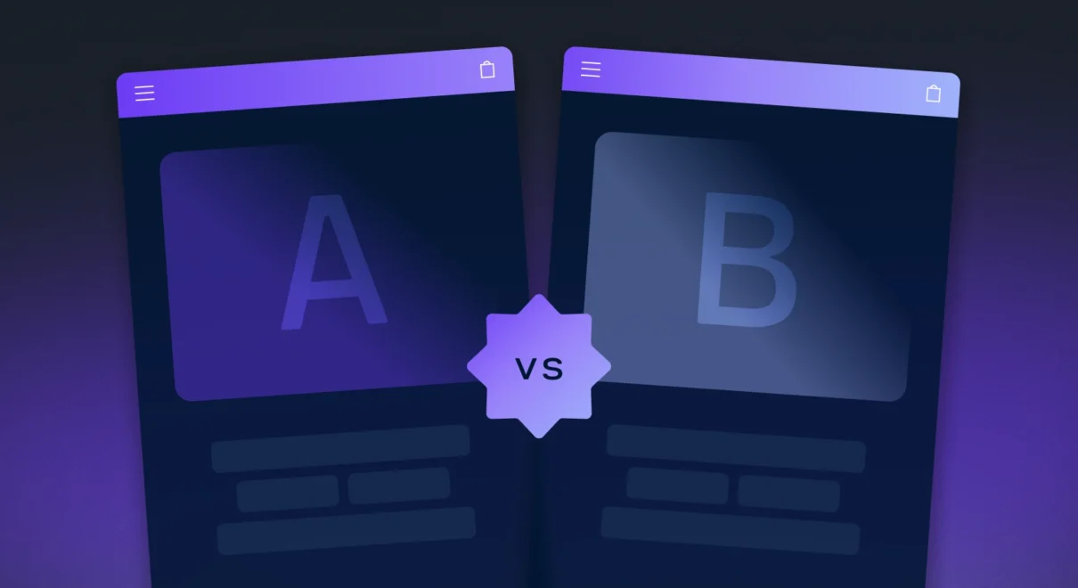
A/B testing for e-commerce stores is one of the most powerful ways to boost sales using real data instead of guesswork. By comparing two versions of a webpage or element, online retailers can identify what truly drives conversions and optimize their stores for maximum performance.
By using this data-driven approach, you can increase sales, improve user experience, and maximize the effectiveness of your marketing campaigns. In this guide, we’ll cover everything you need to know about A/B testing for e-commerce stores, including why it matters, what to test, and how to get started.
1. What is A/B Testing?
A/B testing involves creating two different versions of a webpage or element and dividing your traffic between them. Then, by analyzing how users interact with each version, you can determine which one drives better results.
For example, you might test two versions of a product page with different headlines, images, or call-to-action (CTA) buttons. As a result, you can clearly see which version leads to more purchases.
2. Why is A/B Testing Important for E-commerce?
A/B testing helps e-commerce stores make data-backed decisions rather than relying on assumptions or guesswork. In other words, it replaces opinions with measurable insights.
Here’s why it’s essential:
Increase Conversion Rates: By identifying which elements resonate most with your audience, you can make adjustments that lead to higher conversion rates. Consequently, even small improvements can generate significant revenue growth.
Improve User Experience: Testing different designs, layouts, and content allows you to create a smoother shopping experience. As a result, you reduce friction and boost sales.
Optimize Marketing Campaigns: A/B testing helps determine the best messaging, offers, and ad creatives. Therefore, your advertising becomes more effective and cost-efficient.
Lower Cart Abandonment Rates: Since many shoppers drop off at checkout, testing checkout page designs can reveal hidden friction points. Ultimately, this leads to fewer abandoned carts.
3. Key Elements to Test in E-commerce A/B Testing
To maximize results, it’s important to focus on elements that significantly impact user behavior and conversions. Below are the most critical areas to test:
a. Product Page Elements
The product page is where most buying decisions are made. Therefore, optimizing it can lead to substantial conversion improvements.
Consider testing:
-
Headlines: Experiment with different value propositions.
-
Product Descriptions: For instance, compare detailed descriptions with bullet-point summaries.
-
Images and Videos: Additionally, test different angles, zoom features, or demo videos.
-
Pricing and Discounts: For example, compare “20% off” versus “Save $10” messaging.
b. Call-to-Action (CTA) Buttons
CTA buttons guide users toward taking action. Because of this, even minor tweaks can make a noticeable difference.
Test the following:
-
Button Text: For example, try “Add to Cart” versus “Buy Now.”
-
Button Color: Similarly, experiment with contrasting colors.
-
Button Placement: In some cases, moving the CTA higher on the page increases clicks.
c. Checkout Process
The checkout stage is critical. However, it’s also where many customers abandon their carts.
You can test:
-
Number of Steps: For instance, compare single-page checkout with multi-step checkout.
-
Form Fields: By reducing required fields, you may lower friction.
-
Payment Options: Additionally, highlighting trusted payment methods can build confidence.
d. Homepage and Navigation
Your homepage creates the first impression. Meanwhile, your navigation determines how easily visitors find products.
Consider testing:
-
Homepage Banners: For example, compare promotional messaging versus product-focused messaging.
-
Navigation Layout: In addition, test simplified menu structures.
-
Search Bar Visibility: Often, making the search bar more prominent improves usability.
e. Promotional Campaigns and Offers
Promotions can significantly influence buying decisions. Nevertheless, not all offers perform equally well.
Test variations such as:
-
Discount Formats: Compare percentage-based versus dollar-based discounts.
-
Limited-Time Offers: For instance, add countdown timers to create urgency.
-
Free Shipping Thresholds: As a result, you may increase average order value.
4. Best Practices for Effective A/B Testing
Although A/B testing provides powerful insights, it must be done correctly.
a. Set Clear Goals
First, define what you want to achieve. Whether you aim to increase sales or reduce cart abandonment, clear goals guide better experiment design.
b. Test One Element at a Time
To isolate results, test only one variable at a time. Otherwise, you won’t know which change caused the improvement.
c. Use a Sufficient Sample Size
Tests must run long enough to reach statistical significance. Otherwise, the data may be misleading.
d. Segment Your Audience
Not all users behave the same way. For this reason, segment by traffic source, device type, or new versus returning visitors.
e. Continuously Test and Optimize
A/B testing is not a one-time task. Instead, it’s an ongoing process. Consumer behavior evolves; therefore, continuous optimization is essential.
5. Tools for A/B Testing in E-commerce
Several tools can help you run effective experiments:
-
Google Optimize: A free tool that integrates with analytics platforms.
-
Optimizely: A robust experimentation platform for advanced testing.
-
VWO: An all-in-one CRO solution with heatmaps and analytics.
-
Crazy Egg: Combines A/B testing with user behavior tracking.
6. Examples of Successful E-commerce A/B Testing
Real-world examples demonstrate the power of experimentation.
-
Changing CTA Text: After switching from “Shop Now” to “Get Yours Today,” one retailer increased conversions by 10%. Clearly, wording matters.
-
Simplifying Checkout: By reducing checkout steps, a store decreased cart abandonment by 20%. As a result, revenue improved significantly.
-
Adjusting Product Descriptions: Longer descriptions led to a 15% increase in sales. This suggests customers value detailed information before purchasing.
Frequently Asked Questions (FAQ)
1. What is A/B testing in e-commerce?
A/B testing in e-commerce is a method of comparing two versions of a webpage, product page, or checkout element to determine which one performs better. By splitting traffic between Version A and Version B, store owners can use real data to increase conversions and sales.
2. How long should an A/B test run?
An A/B test should run until you reach statistical significance and have a sufficient sample size. In most cases, this means running the test for at least 1–2 weeks, depending on your traffic volume. Ending tests too early can lead to inaccurate conclusions.
3. What elements should I test first?
Start with high-impact areas such as product pages, call-to-action (CTA) buttons, pricing displays, and the checkout process. Since these elements directly affect purchase decisions, optimizing them can quickly improve conversion rates.
4. Can A/B testing reduce cart abandonment?
Yes. By testing checkout steps, form fields, payment options, and trust signals, you can identify friction points that cause users to leave. As a result, many stores see a noticeable reduction in cart abandonment rates.
5. What tools can I use for A/B testing?
Popular tools include platforms like Google Optimize, Optimizely, VWO, and Crazy Egg. These tools allow you to create experiments, split traffic, and analyze results without needing advanced technical skills.
Conclusion
A/B testing is an essential strategy for improving e-commerce performance. More importantly, it enables data-driven decision-making rather than guesswork.
By systematically testing website elements, you can uncover insights that directly impact conversions. Ultimately, the key is to start small, measure accurately, and continuously refine your approach.
If you apply these best practices consistently, you won’t just optimize your store — you’ll build a scalable system for sustainable growth.


